Hello everyone ,i am presenting you a new design and color combination for Loyalty card module if you want to apply it you can copy the source code from bellow code section and paste it in your color-advance css section.
And if you want any changes please reply in comment section.
Before 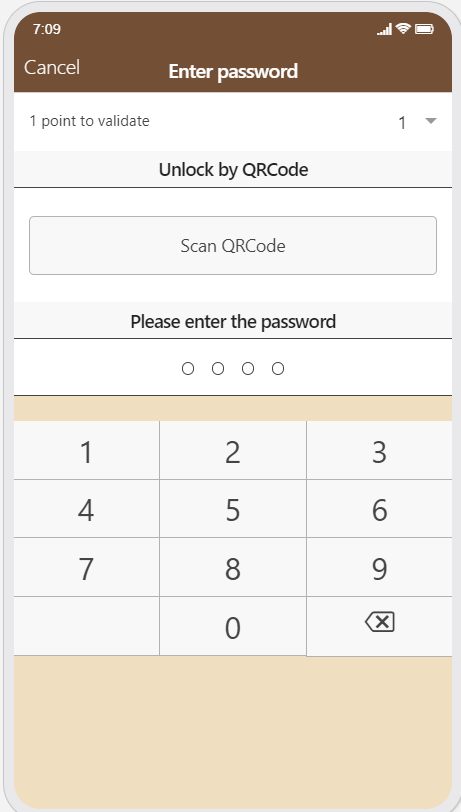 After
After 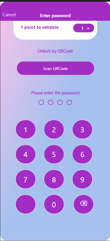
ion-modal-view[class="loyaltycard-view modal has-background-image slide-in-up ng-enter active ng-enter-active"] .bar{
    background: #A32cc4;
}
ion-modal-view[class="loyaltycard-view modal has-background-image slide-in-up ng-enter active ng-enter-active"] {
    background-image: linear-gradient(to left top, #a6c1ee 50%, #fbc2eb 100%)  !important;
   }
ion-modal-view[class="loyaltycard-view modal has-background-image slide-in-up ng-enter active ng-enter-active"] div.list .item-select{
   margin-left: 12%;
   margin-right: 12%;
   padding-left: 24px;
   height: 65px !important;
   border: none;
   background: white !important;
   border-bottom-right-radius: 33px;
   border-bottom-left-radius: 33px;
}
ion-modal-view[class="loyaltycard-view modal has-background-image slide-in-up ng-enter active ng-enter-active"] div.list .item-select .ng-untouched{
    background: #A32cc4;
    width: 25%;
    color: white;
  font-weight: bold;
    height: 46%;
    border-radius: 3em;
    top: 10px;
    right: 10px;
}
ion-modal-view[class="loyaltycard-view modal has-background-image slide-in-up ng-enter active ng-enter-active"] div.list .item-select:after{
    top: 43%;
    right: 25px;
    color: white !important;
}
ion-modal-view[class="loyaltycard-view modal has-background-image slide-in-up ng-enter active ng-enter-active"] div.list .item-select .ng-binding{
   color: #A32cc4;
   font-size: 15px;
}
ion-modal-view[class="loyaltycard-view modal has-background-image slide-in-up ng-enter active ng-enter-active"] div.list .item.item-custom{
    background: none ;
    border:none;
}
ion-modal-view[class="loyaltycard-view modal has-background-image slide-in-up ng-enter active ng-enter-active"] div.list .item-select p{
   font-weight: bold;
}
ion-modal-view[class="loyaltycard-view modal has-background-image slide-in-up ng-enter active ng-enter-active"] div.list .item-divider {
    background: none;
    padding-top: 30px;
}
ion-modal-view[class="loyaltycard-view modal has-background-image slide-in-up ng-enter active ng-enter-active"] div.list .item-custom .filled-dot{
     background: none;
     border-color: transparent;
}
ion-modal-view[class="loyaltycard-view modal has-background-image slide-in-up ng-enter active ng-enter-active"] div.list .item-custom .dot{
     width: 18px;
     height: 18px;
     border: 2px solid;
     border-color:#A32cc4;
}
ion-modal-view[class="loyaltycard-view modal has-background-image slide-in-up ng-enter active ng-enter-active"] div.list .dots{
     padding-top: 10px;
}
ion-modal-view[class="loyaltycard-view modal has-background-image slide-in-up ng-enter active ng-enter-active"] div.list .item-custom .filled-dot{
     background:#A32cc4;
}
ion-modal-view[class="loyaltycard-view modal has-background-image slide-in-up ng-enter active ng-enter-active"] div.list .item-custom .button-custom {
     background-image: linear-gradient(to top, #A32cc4 100%, #a6c1ee 40%);
     width: 75%;
     height: 38px !important;
     color: white;
     left: 45px;
     border-radius: 5em;
}
 ion-modal-view[class="loyaltycard-view modal has-background-image slide-in-up ng-enter active ng-enter-active"] div.list .item-divider .ng-binding{
     color:#A32cc4;
}
ion-modal-view[class="loyaltycard-view modal has-background-image slide-in-up ng-enter active ng-enter-active"] div.list.pad{
     padding: 4px;
}
ion-modal-view[class="loyaltycard-view modal has-background-image slide-in-up ng-enter active ng-enter-active"] div.pad .button-custom{
     margin: 10px 14px;
     width: 23%;
     border-radius: 50%;
     background: #A32cc4;
     height: 65px !important;
     padding: 0;
     color: white;
     border: 1px solid #fff;
     border-color: white;
}
ion-modal-view[class="loyaltycard-view modal has-background-image slide-in-up ng-enter active ng-enter-active"] div.pad .buttons{
    width: 300px;
    margin: auto;
}
utsav mishra Asked question